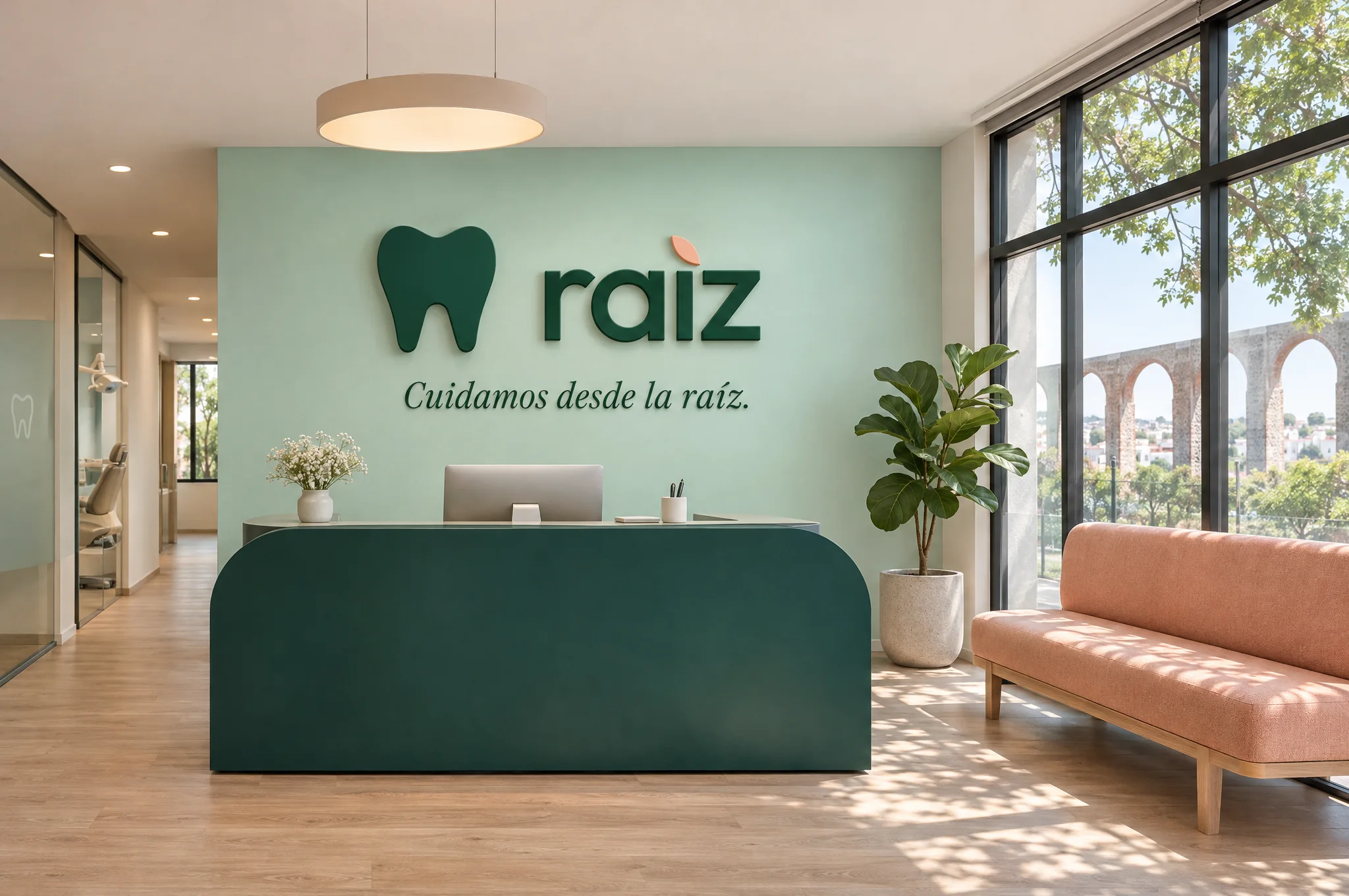
A clinic children are not afraid of
Raíz imagines a small clinic that sees whole families, from a child’s first check-up to an adult’s braces. The brief was a brand that feels warm without looking like a toy shop, so parents trust it and children don’t dread the visit.
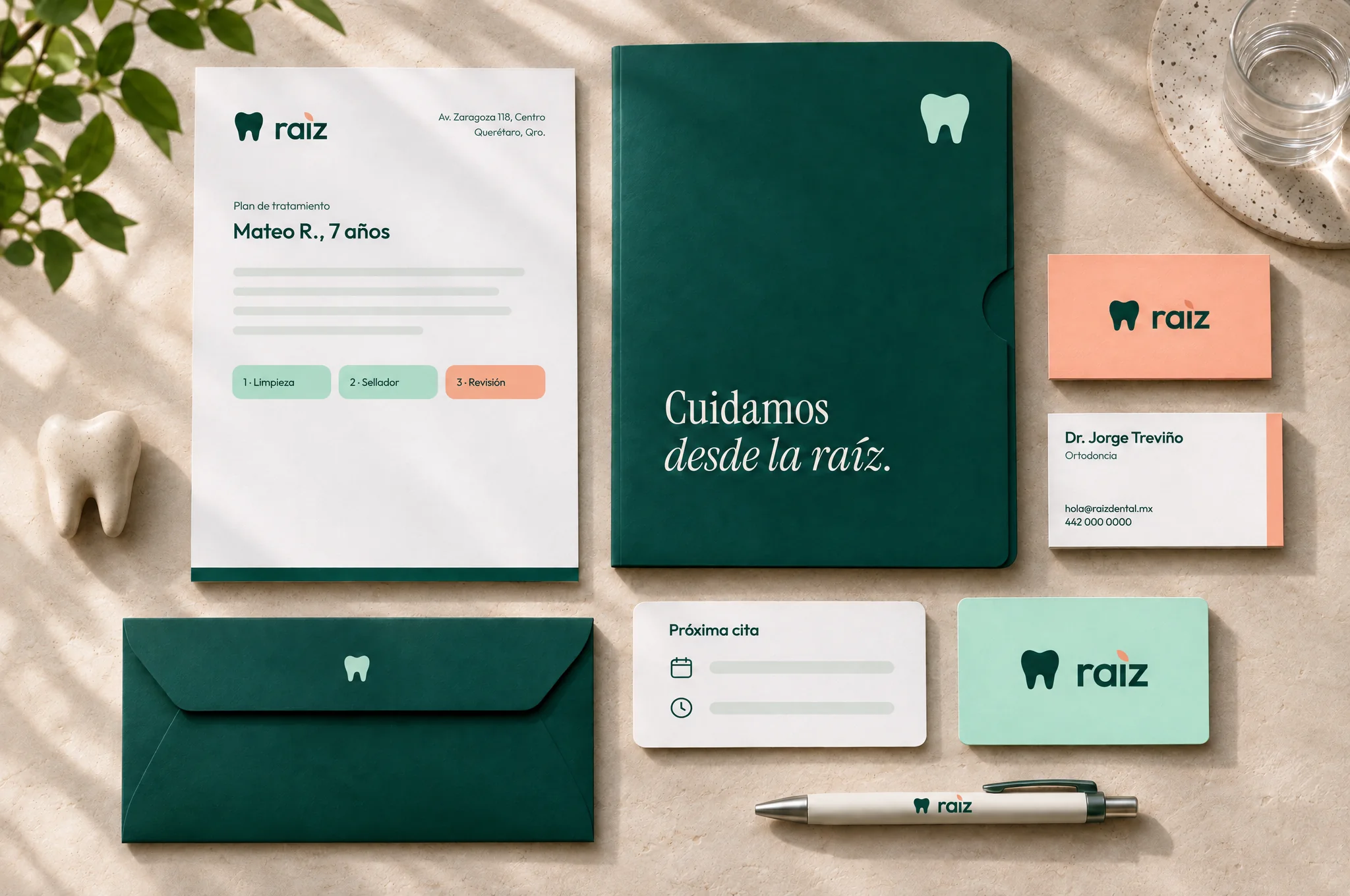
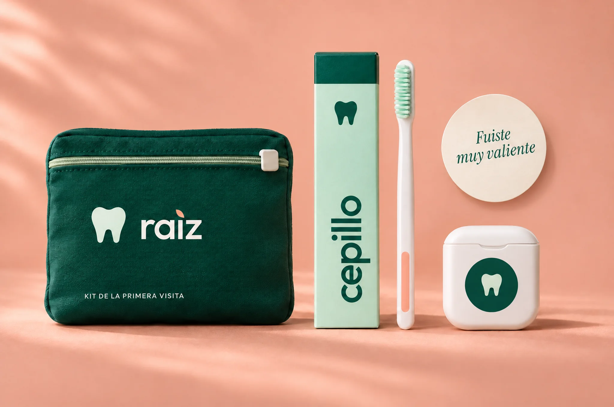
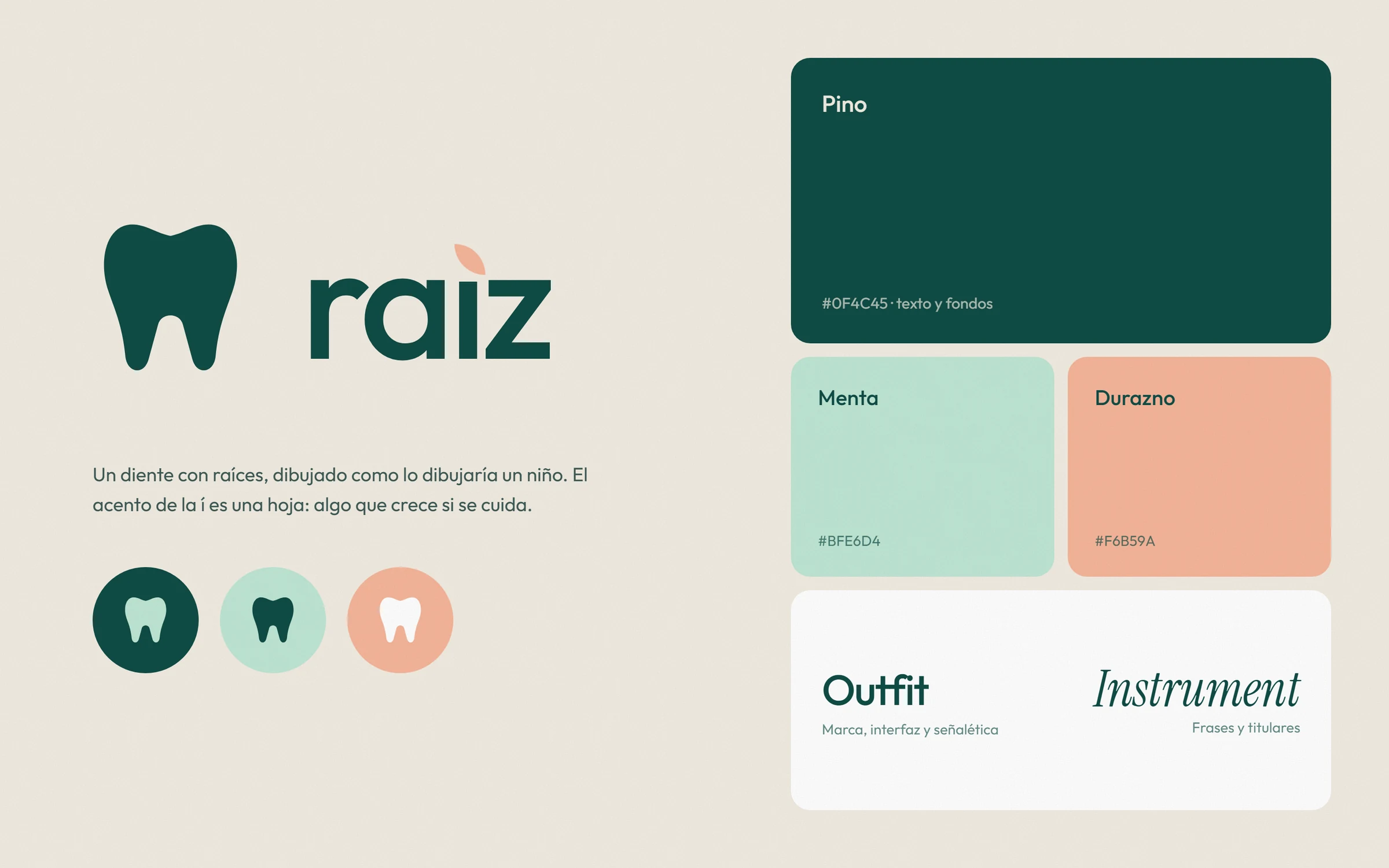
The mark is a tooth with roots, drawn the way a child would draw one. The accent on the í becomes a small peach leaf, something that grows if you look after it. Pine green carries the trust, mint and peach keep it friendly, and a soft italic serif writes the lines people remember.
Identity system
A tooth drawn the way a child would draw it, and a leaf in place of the accent.
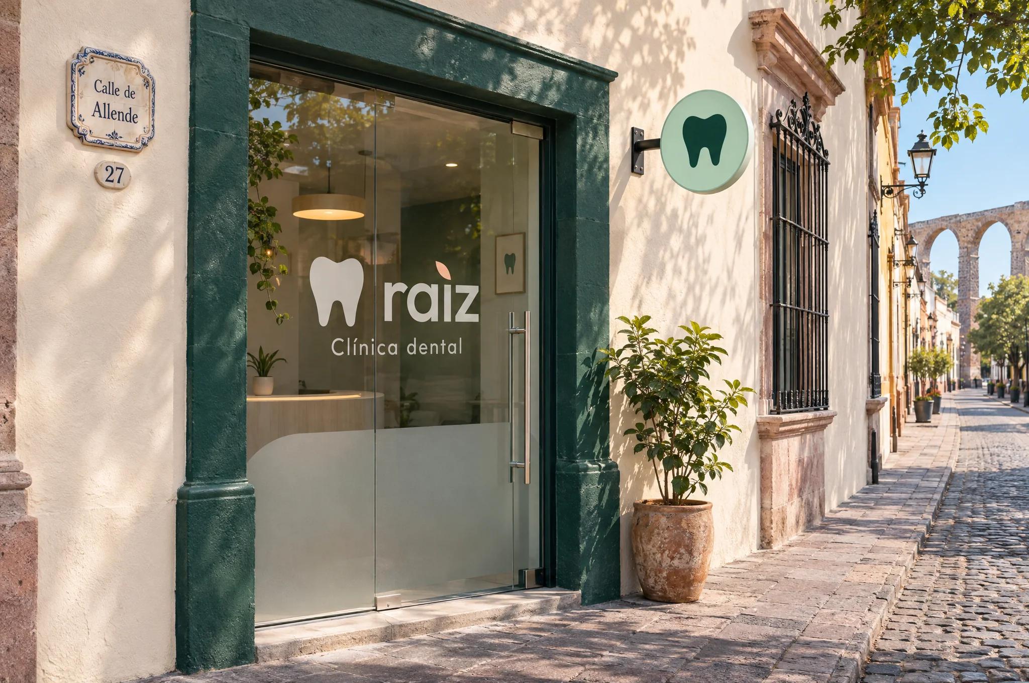
Applications
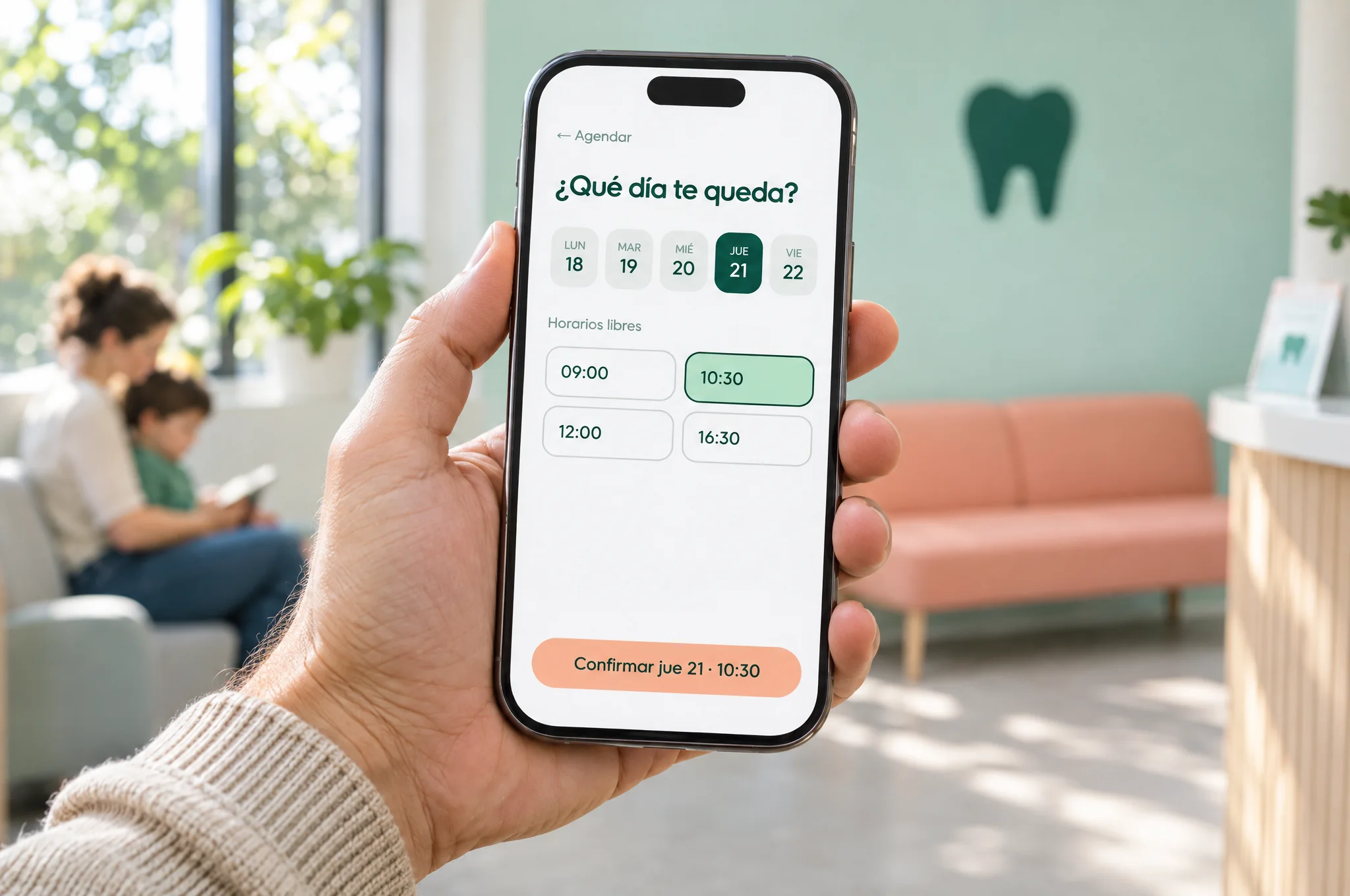
Digital mockups