An eye for what belongs together
Off the Edit imagines a shop where a jacket from one label can make sense next to trousers from another. The name borrows from editorial language. Each delivery gives the shop another chance to show how its selection fits together.
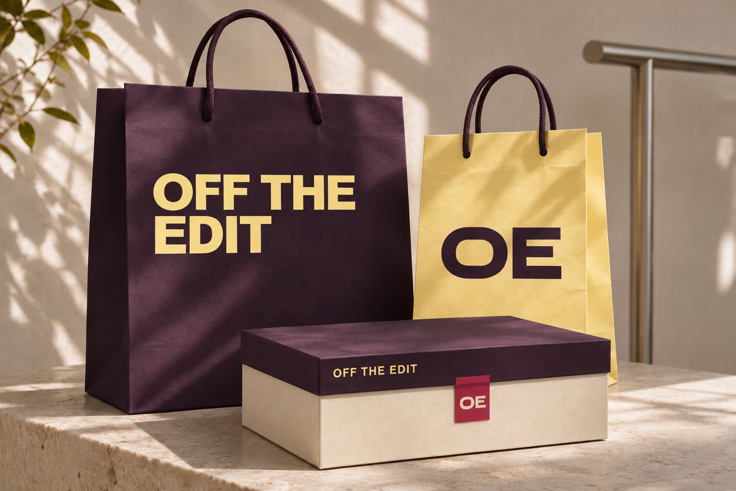
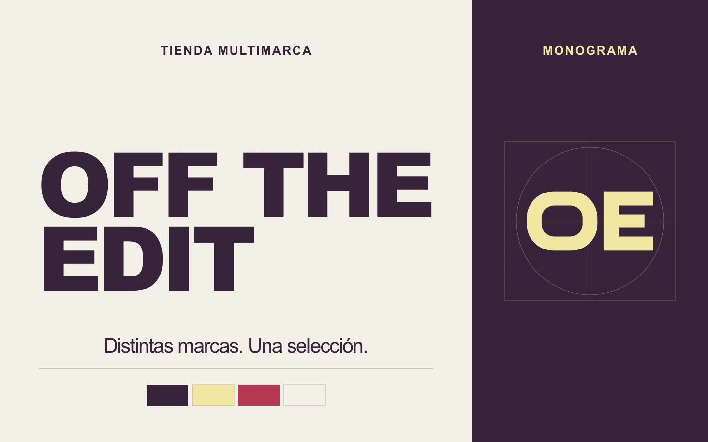
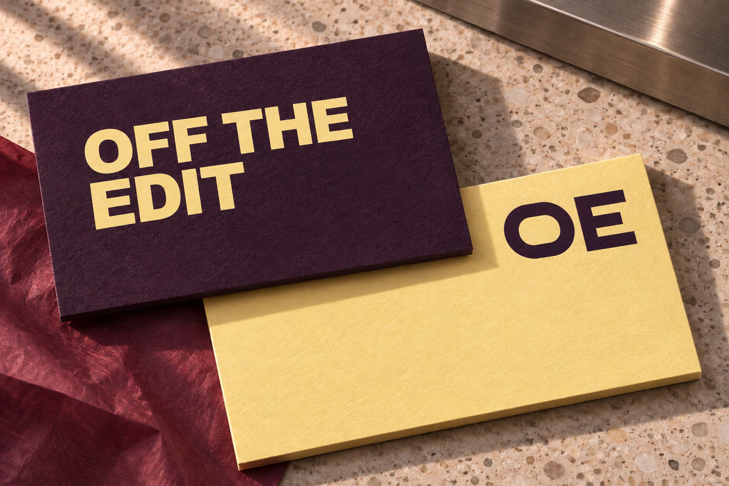
The stacked name makes the most of a tall shopping bag. A compact OE monogram signs smaller pieces such as a store card or box seal. Plum and butter yellow give both marks a consistent pairing, with a raspberry seal to mark the point where the box opens.
Identity system
The full name anchors the shopping bag. The monogram carries the store’s identity onto cards and seals.
Applications
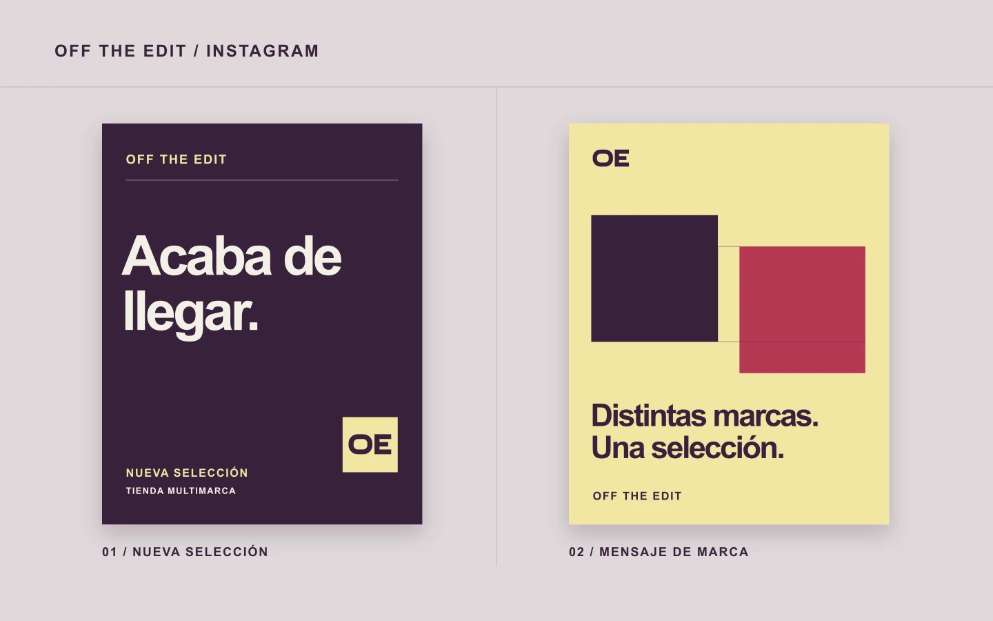
Digital mockups
Web design
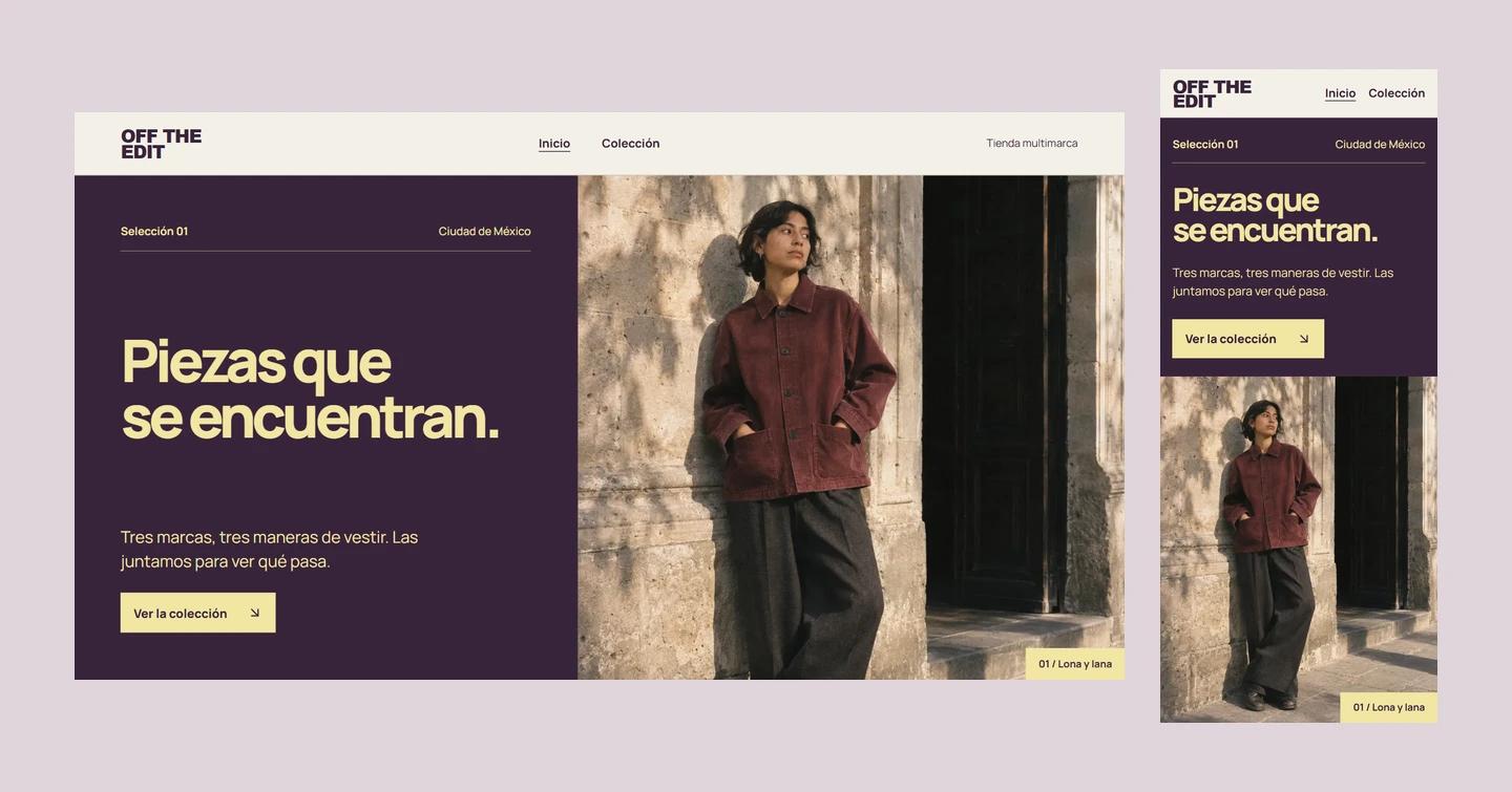
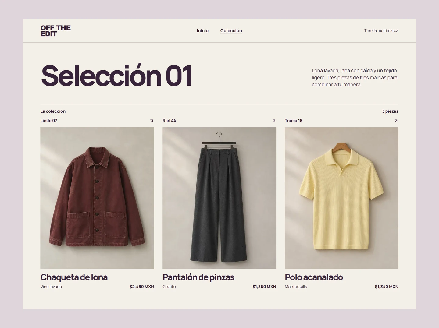
The homepage introduces the collection through a styled look. The product grid gives each clothing label its own place.