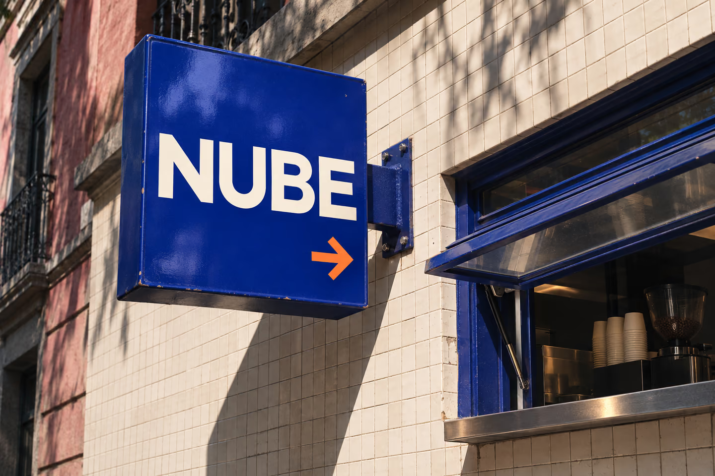
A coffee between stops
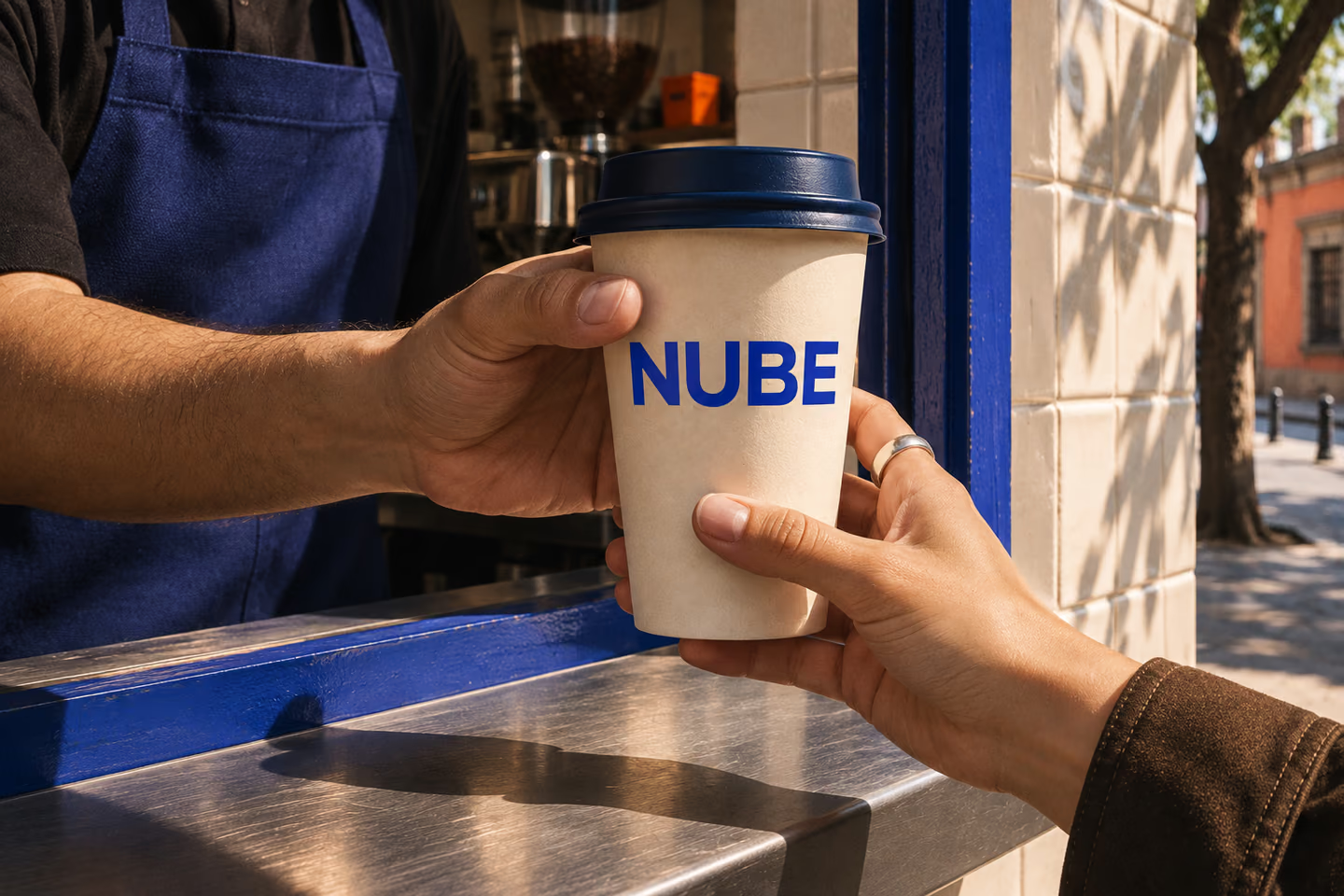
NUBE imagines a small walk-up window for the coffee you grab between the metro and your next stop. The brief was to build a brand someone could recognise from across the street and recognise again in their hand a minute later.
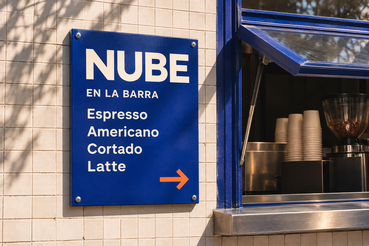
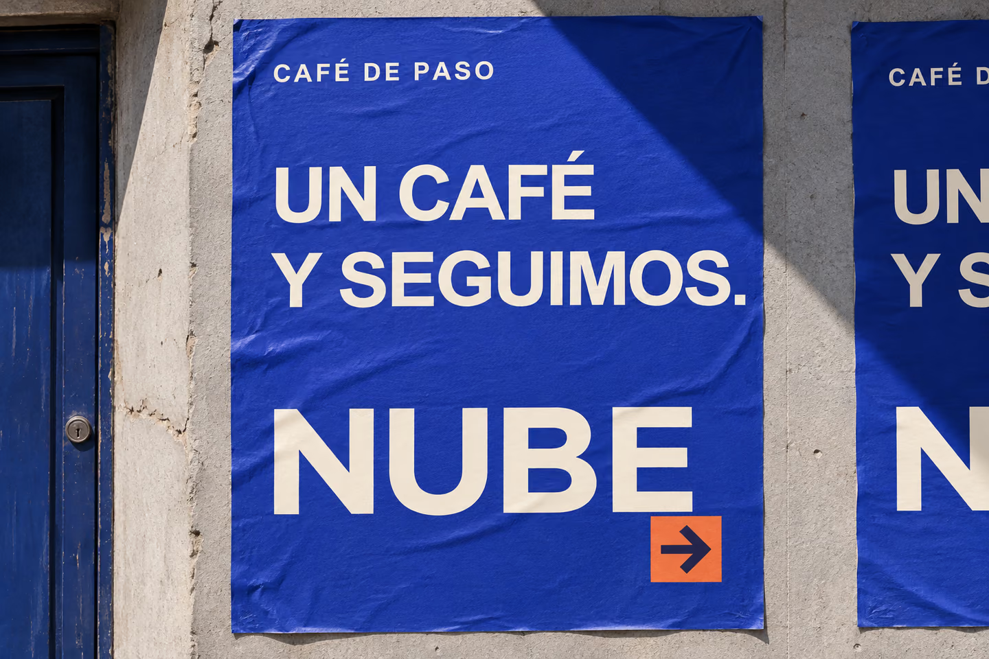
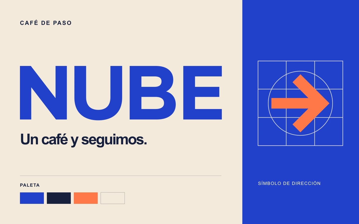
That starts with four wide letters that read quickly on a projecting sign. Cobalt carries from the street into the shop, cream keeps the name legible, and a small orange arrow points to the window. The campaign line, “Un café y seguimos,” carries that rhythm into the street posters.
Identity system
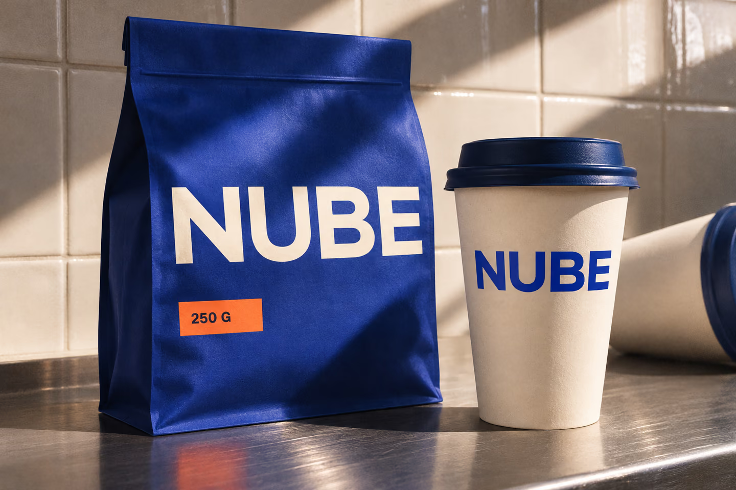
A drawn wordmark, a directional mark, and four colours that carry across signs, ink, and paper.
Applications
Digital mockups